
As 2026 marks the 70th anniversary of the biggest music contest in the world, we will be expecting many surprises and celebrations to commemorate this mark. And these surprises started a bit early, as the European Broadcasting Union (EBU) has revealed a brand-new logo, font and visual identity for the next contests.
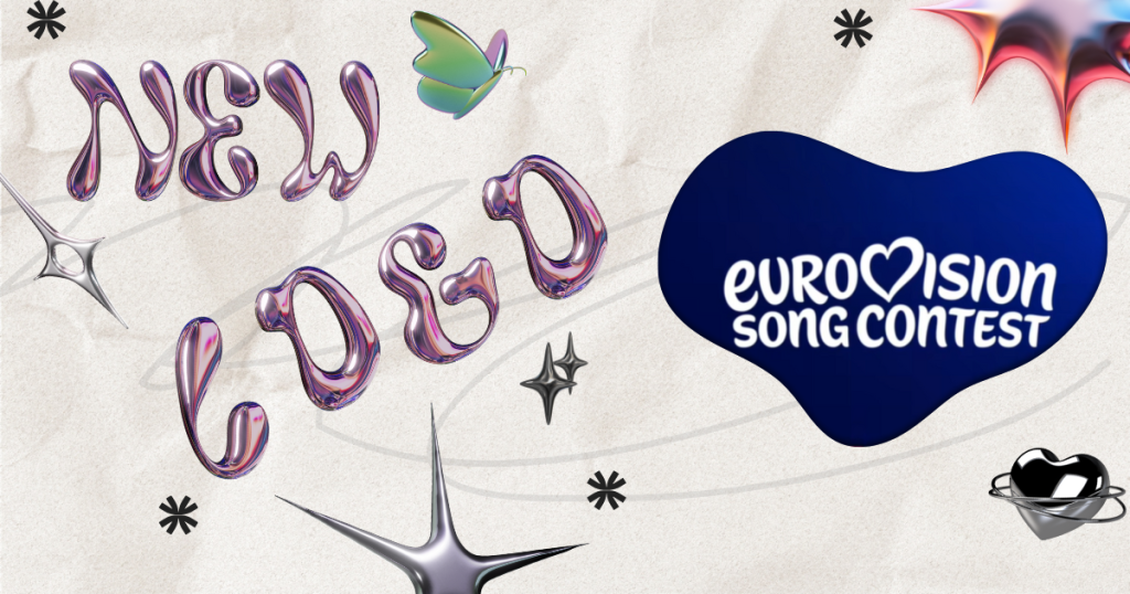
New logo, font and brand identity
Say hello to a bold new era of Eurovision branding and the elegant and playful new typeface, ‘Singing Sans’. Designed especially for Eurovision, this custom font brings a fresh, modern, and dynamic feel that still holds onto the magic we all love.
But the biggest showstopper? The ‘Chameleon Heart’. This isn’t just your average beating heart — it’s a 3D marvel made up of 70 shimmering layers, each representing one unforgettable year of Eurovision history. As the name suggests, the heart will adapt each year to reflect the host country’s culture, colours, rhythm and movement — giving every edition a truly local heartbeat.
The new branding is a creative collaboration between the EBU and the British design studio PALS, the same talented minds behind the vibrant 2023 Liverpool contest visuals.
History of Eurovision logo
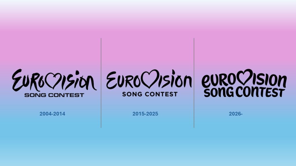
Let’s take a trip back in time to remember the Eurovision logo’s journey! In the early years, between 1956 and 2003, each host broadcaster created its own logo. It wasn’t until 2004 when EBU introduced the first standardised logo- the now-famous handwritten-style ‘Eurovision’ logo, where the letter V is replaced by a heart containing the host country’s flag.
This standardized logo served until 2014, when it was redesigned to a more modern version to celebrate the 60th anniversary of the contest. This newer version was similar to the old one but had an updated font, a cleaner lettering and a more polished heart.
Now a decade later celebrating the 70th contest we have a new kid on the block- the eurovision heart is still there but the letter E is now lower case and has a new font ‘Singing Sans’.
This logo drop is just the beginning of the 70th anniversary celebrations, and what a better way to celebrate than a brand new logo!
What do you think of the new look? Is it love at first sight or are you team Classic Heart forever? Drop your thoughts in the comments!

