With the announcement of the brand-new Eurovision look last week, we thought- what better time to take a trip down memory lane and revisit the logos that have defined the world’s biggest song contest?
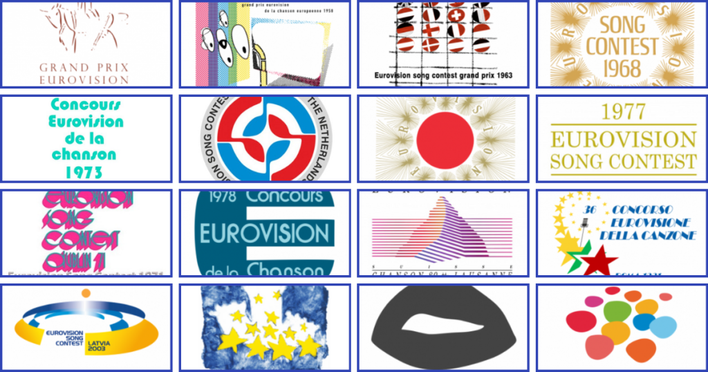
Before 2004, there was no standardised Eurovision logo. Each year, the host broadcaster would design their own visual identity for the contest. Sometimes these logos were inspired by the host country’s culture and heritage; other times, they seemed like a lucky dip of fonts and design trends. So, let’s rewind the tape and look at how Eurovision’s visual style has changed over the decades!
The 50s
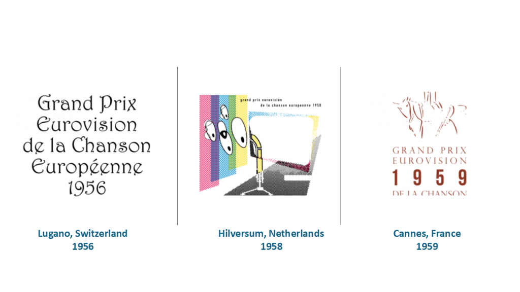
The first Eurovision logos were very delicate, containing calligraphic lettering and thin stokes. The phrase ‘Grand Prix Eurovision de la Chanson Européenne’ was featured, translating to ‘Grand Prix of the Eurovision Song Competition‘, which is how Eurovision used to be called.
The 60s
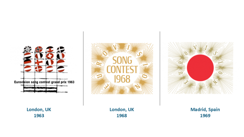
Designs in the 60s remained minimalistic, but we started to see more colour and experimentation. A standout moment came in 1968, when the BBC stage designer Timothy O’Brien created a bold, circular logo that was so successful it was reused in 1969 for Madrid with some alterations. This was one of the first attempts to create a recognisable visual identity across contests.
The 70s
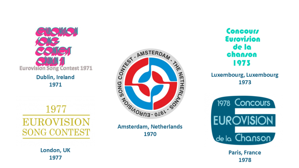
The 70s were known as the disco era, and this can be seen in the logos. The thin lettering was replaced by bold fonts, geometric shapes and lots of colour. Logos from this era started to feel more like posters or graphic artworks, and some hosts adapted groovy styles which defined the decade culturally and musically.
The 80s
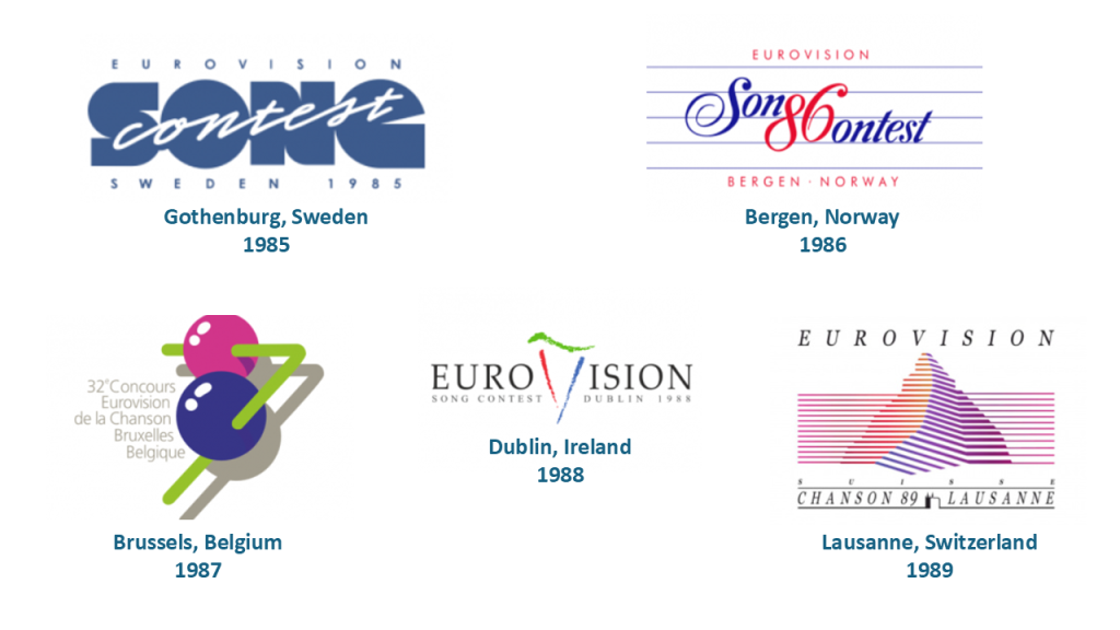
The 80s brought playfulness and symbolism. Logos started to incorporate local cultural elements in clever ways. For example, in the Dublin 1988 logo, the letter ‘V‘ in Eurovision was replaced with an Irish harp, a national symbol. Also in the Lausanne 1989 logo, mountains were featured, a nod to Switzerland’s iconic Alps.
The 90s
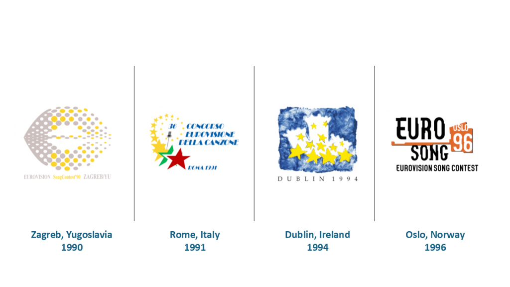
By the 90s, there was a clear effort to blend tradition with modernity. The 1994 Dublin logo featured castles from the city’s coat of arms and the twelve golden stars of the European Union flag. This era was about Europe’s identity—reflected in the contest’s growing political significance post–Cold War and pre–EU expansion.
Designs were still bespoke each year, but we were getting closer to the idea of Eurovision as a unified brand.
The 2000s
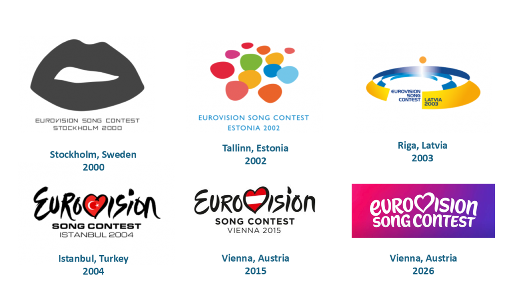
The new millennium brought fresh energy. Logos became bolder and more graphic. For instance the Sweden 2000 logo featured a mouth, symbolising singing, expression and the universal language of music.
Then, in 2004 we have the first standardised Eurovision logo. Istanbul was the first host city to use the now-iconic handwritten-style ‘Eurovision’ logo, where the letter V is replaced by a heart containing the host country’s flag. Designed by the European Broadcasting Union (EBU), this logo became the core identity of the contest, used consistently alongside each year’s bespoke theme artwork.
To celebrate Eurovision’s 60th anniversary in 2015, the logo received a glow-up! The font was updated to a cleaner, more modern typeface, and the heart got a polish. This version balanced playfulness with prestige, showing how far the contest had come—from a pan-European experiment to a global cultural phenomenon.
Now a decade later celebrating the 70th contest we have a new kid on the block. The eurovision heart is still there but the letter ‘E‘ is now lowercase and has a newly formed font, ‘Singing Sans’. It’s sleek, digital-friendly, and reflects how Eurovision continues to reinvent itself in every decade.
And fun fact: both anniversary redesigns—2015 and 2026—happened when Vienna was involved. Coincidence? Or is Vienna just Eurovision’s lucky charm?
What do you think?
And that concludes the history of Eurovision logos! From calligraphy and castles to hearts and hashtags, Eurovision logos have always reflected the spirit of the times. Which one is your favourite? Do you prefer the old-school country-specific designs or the modern branding we see today?
Let us know in the comments—because Eurovision isn’t just about the songs, it’s about the look too. 😉

